UX to the MAX:
Testing HBO Max's Usability
In 2020 during the pandemic, over 1 billion consumers had subscribed to streaming subscriptions worldwide as many passed the time by watching movies safely at home.
With Disney's streaming app launching and competition multiplying, HBO ultimately decided to release their app prematurely and acknowledged it was far from a perfect product, leading to harsh criticisms from their users.
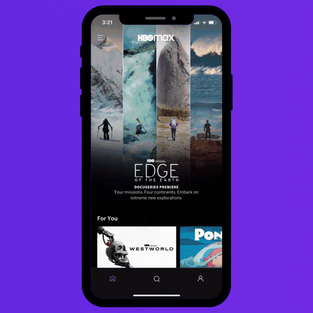
I was part of a student UX research group working on an ambitious project to improve the app's functionality, specifically testing the profile features and understanding how users track shows to watch later and offline.
I was involved in all aspects of the research project including: scheduling meetings, performing secondary research, designing the research plan, recruitment strategy and outreach, piloting and conducting the usability test, analysis of results, synthesizing the results into findings and recommendations, reaching out to stakeholders to present to, and presenting to 2 UXR stakeholders.
This project is not directly affiliated with HBO Max.
After presenting our report below to a senior UXR stakeholder at HBO Max, he said:
“I was impressed with your research and found quite a few parallels with my own research. Keeping pursuing UXR work, you have a promising future in it.”
- Senior UX Researcher, HBO Max
OUR RESEARCH PROCESS

THE CHALLENGE
REVAMP THE APP'S USABILITY
We investigated if users of HBO Max had experienced issues with the app by performing secondary research on HBO Max Reddit forums, Facebook groups and Apple reviews.
We found that many users experienced issues tracking shows to watch later and the sign-on process. Our secondary research inspired us to focus our project on HBO Max and their user experience.
Some screenshots are listed below of online articles from our secondary research:


WHO TO INCLUDE?
RECRUITMENT STRATEGY
Participants were recruited in different geographic locations in the USA. 19 participants were recruited via a convenience sample and included the following to ensure we remained inclusive and representative:
-
20 - 65 years old (Anyone over 18 could participate)
-
10 women, 8 men, and 1 non-binary (A mix of genders were welcomed)
-
Experience using the HBO Max app
-
Current subscribers
KICKOFF
USABILITY TEST STRATEGY
Our initial user journeys included in our moderation guide were broad to allow for discovery into which feature caused the most difficulty and frustration. By conducting usability tests, we uncovered the "why" behind users' behavior, needs and their expectations with the app.
Example research questions we asked on our moderator guide included:
-
What do you think about the way the categories of shows are presented, if anything?
-
How would you go about keeping track of shows you want to watch later? What do you expect to happen once this "+" sign feature becomes a check mark, if anything?
-
How unintuitive, or unintuitive, was it to add a show to to watch offline?
We conducted 19 usability tests (8 of which were pilot tests) with HBO Max users and recognized that participants were having issues primarily with tracking shows to watch later and to watch offline.
We iterated our research questions and moderator guide to include if participants are able to:
-
Easily add a a show and navigate to their favorited list?
-
Easily download a show and navigate to their downloads list?
-
Remove a show from their lists easily?
WHAT WE FOUND
INSIGHTS AND RECOMMENDATIONS
The project remained on schedule throughout the engagement, and the final report was met with an overwhelmingly positive stakeholder reaction from HBO Max and our professor supervising the project.
Our findings and recommendations included increasing visual and sensory feedback provided to improve the interaction between user and app, with 3 findings and insights below:
LITTLE VISUAL FEEDBACK:
-
Finding: Users were confused by the lack of visual cues when adding a show to track later and looked for feedback that they completed the correct action.
-
Recommendation: We recommend replacing static visual cues with dynamic, interactive visual cues which provides stronger confirmation that an action has been completed.

VAGUE LANGUAGE:
-
Finding: Users had difficulty understanding the difference between the "Just Added" section and the "My List" section, and initially thought they would find shows they added to their lists under the "Just Added" section.
-
Recommendation: We recommend ensuring the language articulates a feature's purpose clearly and succinctly so users do not have to decipher vague jargon.

DIFFICULTY NAVIGATING:
-
Finding: Users were uncertain of where to locate their lists with shows to watch later. This was because the list of shows were found on their profile section, which is indicated by a "person" icon. Users have a mental model that a "person" icon represents their settings so users were confused to find their movie lists there.
-
Recommendation:
-
We recommend housing the lists in a different area of the app that coincides with existing mental models. Housing the lists in the side menu where the genres and collections of movies are found should be considered.
-
Incorporating app badges so that a user is aware that a show has been added there could also be useful.
-

Served Podcast Analyst Report by Emily Killam - Sept 2025_SHARE.pdf